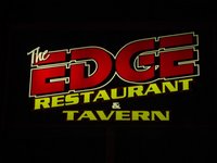
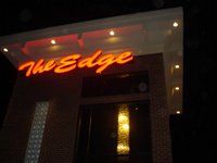
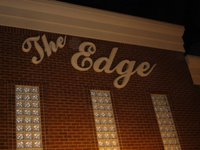
 They are tearing up a major thoroughfare near my home. On this road is a new restaurant. On a recent drive home, I was weaving about the construction when I noticed this new restaurant’s sign. Correction: signs. As in three (3).
 Not a big deal, right? When you’re a roadside business, your sign is a major tool. Can't hurt to have three of them. However, as you can see here, this restaurateur has made a critical error by implementing three signs with three very different
 logos/typefaces. Ouch.
 Talk about a sending a confusing message. “The Edge” is a relatively vague name for your business. Especially when you use three different logos that offer three very different interpretations.
- Roadside sign — Modern-looking, techy (?) font w/’Restaurant and Tavern’ subheading. This initially had me thinking it was more of a club/meat market …
- Building sign A – Neon, modern script font. A supper club?

- Building sign B – Classical, script font. A classy, high-end ristorante?
Another important lesson that this calls to mind is the one that reminds you not to try to be everything to everyone. This is a recipe for the generic. Make a choice. Pick one of the types of restaurants described above and live that message. Or better yet, work with a designer to capture your new brand's essence visually.
All of these thoughts went flying through my mind at 35 mph in road construction. I narrowly missed putting the car into the ditch. Bad marketing can mess up your day big time.
The Point? You can’t be everything to everyone so don’t try. Pick something and do it steadfastly and consistently. And get a professional designer (at least for your logo!).
The Punchline? All of this curiosity did make me try the restaurant and it was great. (FYI: Probably more of a sign #2 – building sign A. It was classy but still with some funk).


No comments:
Post a Comment